wholemeal bread producer website
abc
Client
SBACK
SBACK is a producer of wholemeal bread. Thanks to the production technology SBACK bread retains beneficial enzymes, amino acids and vitamins, and the shelf life of the bread reaches 180 days, preserving the healthy composition
web service
ux/ui
+x
-x
Create a multi-lingual website for B2B audiences to introduce distributors to the brand and its products
project aims
concept

In the concept of the site we have combined tradition and modernity. The airy composition using the classic symbol of bread - the ear, the shape of which is based on the elements of the logo

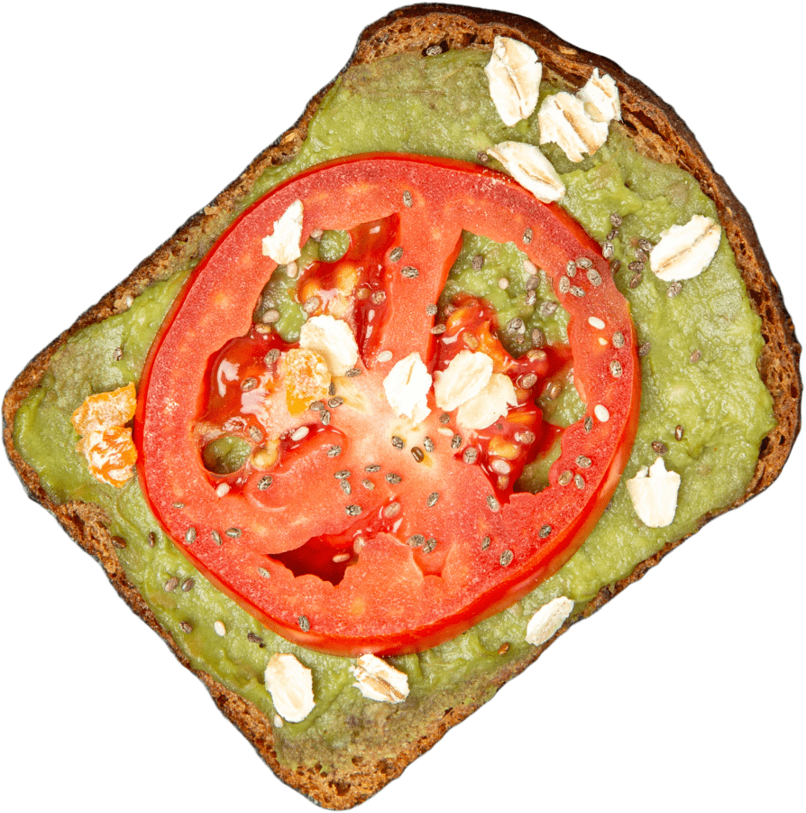
It is important to show bread in the context of its use - in dishes. That's why we took light and juicy photos of SBACK bread-based dishes
pictures
By the way, we marked all the recipes on the site, so customers can try the bread in an interesting combination of flavors. For each recipe card, the type of bread used is indicated, so that the customer can find the best recipe
recipes


typography and colours

For accents we used bright colors from the natural palette, which are associated with leaves of fresh herbs or ripe bell peppers

The client had already cooperated with the X5 retail group and SBACK products had a lot of positive feedback. We did not ignore this fact and added the average value of scores to product cards
reviews


The website details the product, highlighting its features for both partners and consumers
result


